
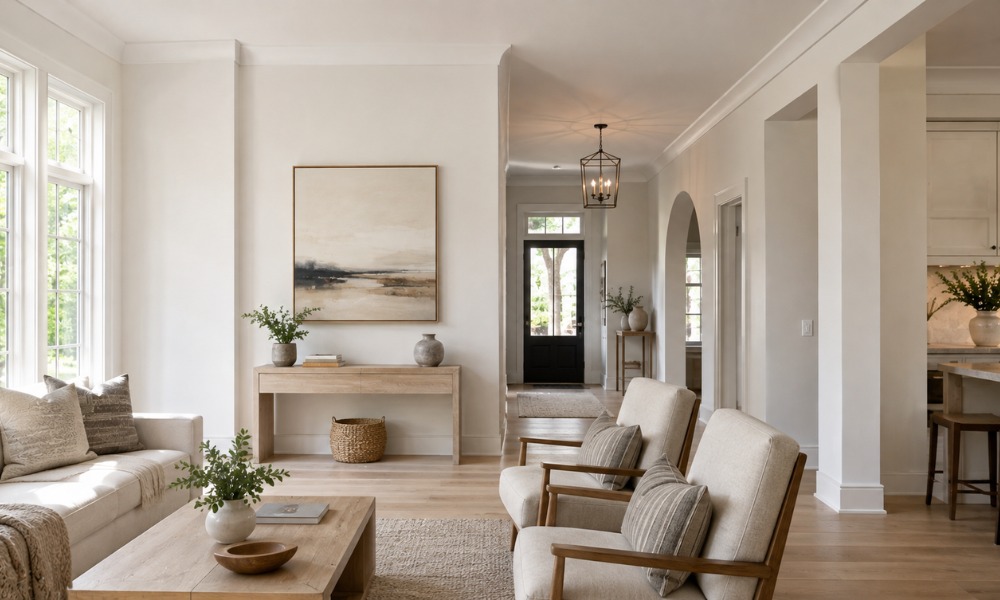
Choosing the best white paint colors for walls is harder than it sounds. Every white has an undertone that shifts with your lighting, furniture, and flooring. Get it wrong and a white wall can look pink, yellow, or flat-out dingy before the paint is even dry.
Key Takeaways
- Every white paint has an undertone (warm, cool, or neutral) that changes how it looks in your specific room.
- Natural light direction matters: north-facing rooms read cooler, south-facing rooms read warmer.
- Testing a large sample swatch on your actual wall is the only reliable way to preview a white paint color.
- Popular whites like Benjamin Moore Chantilly Lace and Sherwin-Williams Alabaster work in very different settings.
- A professional painter can identify undertone conflicts before you commit to a full room.
- Light reflectance value (LRV) determines how bright or muted a white reads in real-world conditions.
Table of Contents
- Why White Paint Is Deceptively Complicated
- How Light Changes Every White Paint Color
- Top White Paint Colors Worth Considering
- How to Compare Whites Before You Commit
- Sheen Levels and White Paint Finishes
- Things to Know
- Get the Right White Paint the First Time
- Frequently Asked Questions
Why White Paint Is Deceptively Complicated
White seems like the safe, neutral choice. However, paint manufacturers offer hundreds of whites. They behave differently depending on the room’s light source, the undertone baked into the formula, and the colors sitting next to them on your walls and floors.
Light reflectance value, or LRV, is one of the first things professionals examine. It’s a scale from 0 (pure black) to 100 (pure white). Most white paint colors sit in the 82-92 LRV range. A paint with an LRV of 90 will make a small room feel noticeably more open than one with an LRV of 82. However, a very high LRV can also amplify undertones. This makes a slightly warm white look yellowy under certain bulbs.
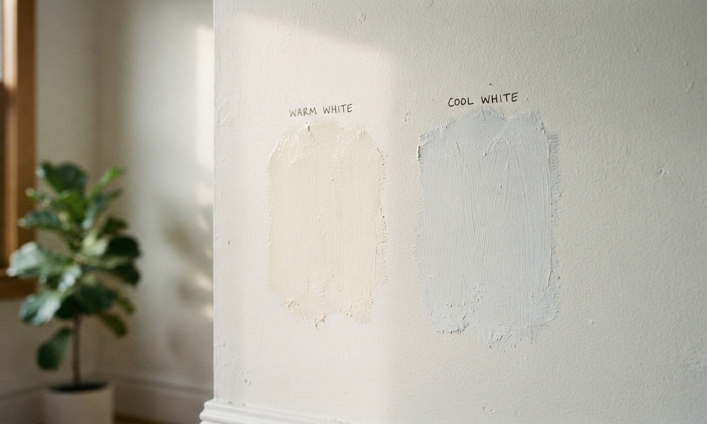
Undertones fall into three broad categories: warm (yellow, cream, red), cool (blue, green, gray), and neutral. A warm white pairs well with wood floors, antique furniture, and warmer lighting. In contrast, a cool white works better in modern spaces with gray stone counters, chrome fixtures, or a lot of natural northern light. Neutral whites try to bridge both. Yet they can still read slightly in one direction depending on the room.
How Light Changes Every White Paint Color
This is the piece most homeowners skip. Additionally, it causes the most regret. The direction your windows face changes how a white reads throughout the day.
North-facing rooms get indirect, cooler light all day. Cool-undertoned whites can look stark or clinical in these spaces. Therefore, a warm white like Benjamin Moore White Dove or Sherwin-Williams Alabaster softens things up considerably.
South-facing rooms get strong, warm sunlight for most of the day. That light amplifies warm undertones. As a result, a creamy white can look yellow by midday. A cooler white or a true neutral tends to balance better here.
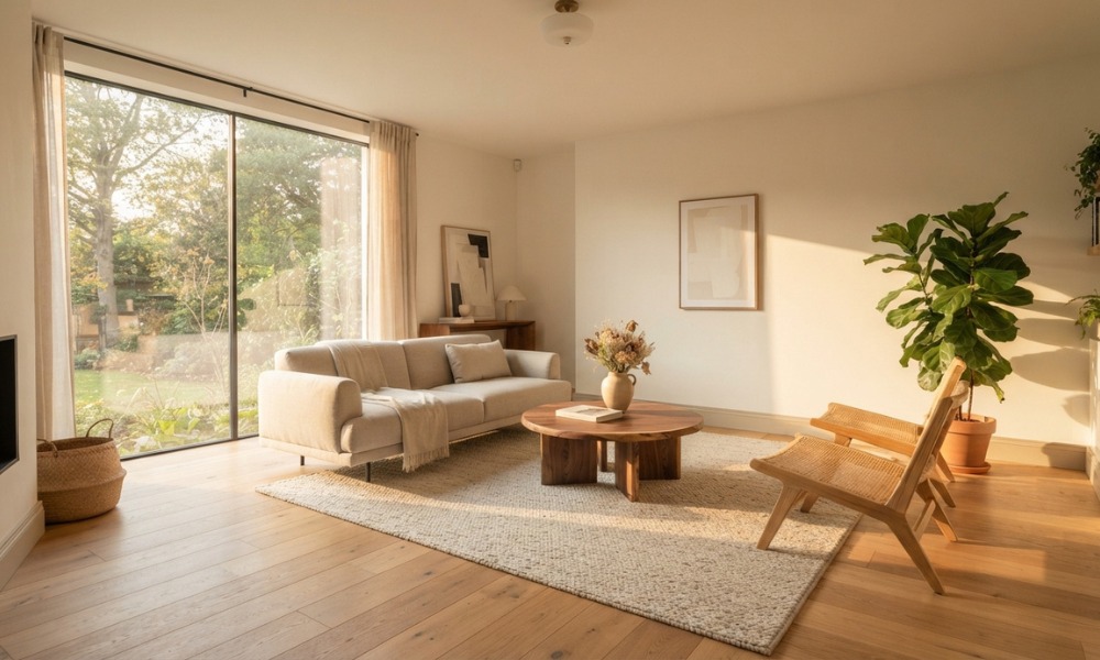
East-facing rooms get warm morning light and cool afternoon light. This means the same white can look completely different depending on when you walk in. West-facing rooms are the reverse. Testing a swatch on the actual wall through multiple times of day is not optional. It’s the only reliable method.
The type of artificial light in the room adds another layer. Incandescent and warm LED bulbs push warm undertones further. Cool daylight bulbs pull in the blue-green direction. Moreover, if you’re repainting a room with fixed light fixtures, factor in those bulb temperatures before choosing your white.
Top White Paint Colors Worth Considering
We’re not going to list every white on the market. Instead, here are well-regarded options across different undertone categories. Professionals and designers commonly use these based on their performance in various settings.
| Paint Color | Brand | Undertone | LRV | Best Setting |
|---|---|---|---|---|
| Chantilly Lace OC-65 | Benjamin Moore | Neutral/Cool | 92.2 | Modern, bright rooms |
| White Dove OC-17 | Benjamin Moore | Warm (soft) | 85.4 | Traditional, transitional |
| Alabaster SW 7008 | Sherwin-Williams | Warm/Cream | 82 | Cozy, wood-heavy interiors |
| Extra White SW 7006 | Sherwin-Williams | Cool/Crisp | 86 | Kitchens, trim, cabinets |
| Simply White OC-117 | Benjamin Moore | Warm | 91.7 | Open-plan, high-ceiling spaces |
| Decorators White CC-20 | Benjamin Moore | Cool/Crisp | 88.8 | Trim, doors, ceilings |
These are starting points. None of them will look exactly the same in your home as they do in a photo online. Lighting, adjacent colors, and sheen level all shift the result.
How to Compare Whites Before You Commit
The standard advice is to buy sample pots and paint large swatches directly on the wall. Large means at least 12 by 12 inches, ideally bigger. Comparing whites on a small chip card under store lighting tells you almost nothing. Your specific home conditions matter far more.
When you apply your test swatches, put them next to each other on the same wall. Look at them in the morning, midday, and evening. Check them with your overhead lights on and off. If two whites look nearly identical under store lighting but completely different on your wall, that’s the undertone responding to your specific room conditions.
One practical tip: paint your sample swatches on a piece of white foam board rather than directly on the wall. That way you can move the board around the room. Hold it against your floors, your trim, and your countertops. This approach saves a lot of touch-up work later.
If you’re unsure about the whole process, what to ask a painter in fairfield ct includes useful questions about color selection and prep. You can get more value from any consultation by asking the right questions beforehand.
Sheen Levels and White Paint Finishes
Sheen affects how white a white looks. A flat or matte finish absorbs light. This hides imperfections, making it a common choice for ceilings and older walls with texture or repairs. An eggshell finish reflects a bit more light. Additionally, it’s easier to wipe clean, making it the standard recommendation for most interior walls. Satin is more durable and often used in kitchens and bathrooms where moisture and scrubbing are regular.
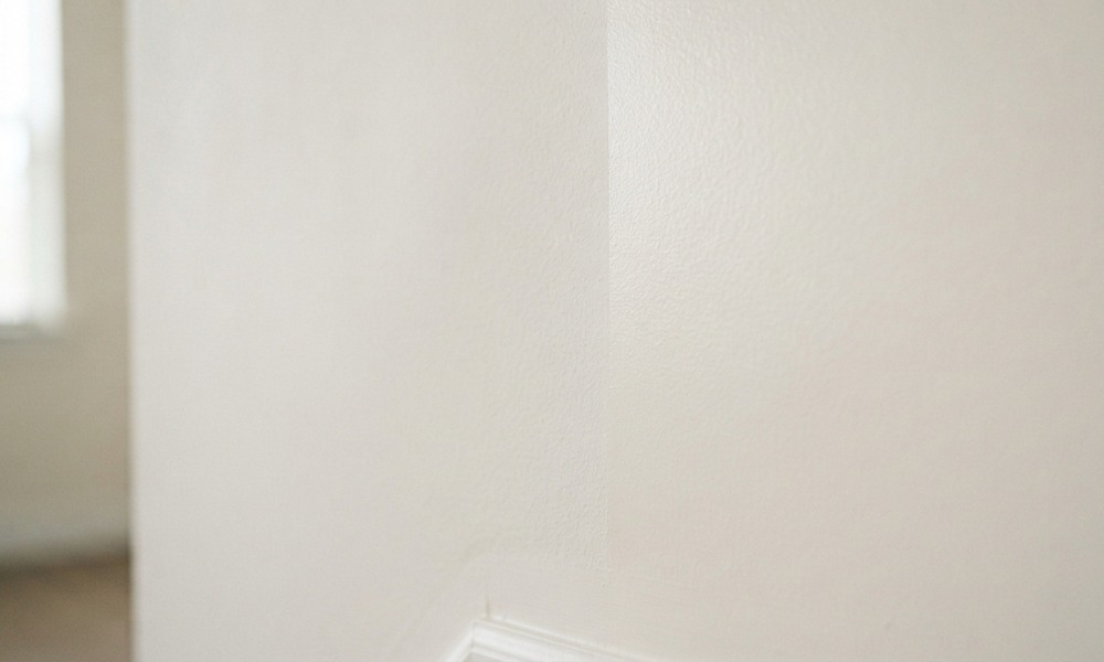
For white paint specifically, a higher sheen can amplify undertones. It can also make wall imperfections more visible. If you’re painting over drywall repairs or textured surfaces, a flat or matte white will be more forgiving. Your painter should advise which sheen works best for the specific wall condition you’re dealing with.
Things to Know
- White paint can look dramatically different on the same wall as seasons change. Natural light shifts with the time of year.
- Always prime before applying white. This is especially important when covering dark or saturated colors. Skipping primer is one of the most common reasons white paint looks uneven.
- Understanding the cost to paint the exterior of a house in fairfield ct can help you budget realistically when extending a white palette to your home’s exterior.
- Not all whites are appropriate for exterior use. Interior formulas are not weather-rated. Verify the paint’s application specs before buying.
- Knowing what fairfield homeowners should expect from an exterior painting contractor helps you evaluate contractor thoroughness. Good contractors pay attention to prep, priming, and product selection.
Get the Right White Paint the First Time
Picking the best white paint colors for walls is one of those decisions that looks simple. However, you may end up staring at a room that reads yellow under your recessed lights. If you want professional eyes on your color selection before you commit, Fairfield Painting Contractors works with homeowners across Fairfield, CT. They nail the prep, the primer, and the color from the start.
Before hiring anyone, reviewing diy vs professional painting what fairfield homeowners need to know is worth your time. You should weigh the cost-benefit of doing it yourself.
Reach out to Fairfield Painting Contractors today for a consultation. Let a licensed, locally operated crew take the guesswork out of your next interior project.
Frequently Asked Questions
Q: What is the most universally flattering white paint color for interior walls?
Benjamin Moore Chantilly Lace and White Dove are among the most widely used whites across different home styles and light conditions. Chantilly Lace is a crisp, near-neutral white. It works well in modern and transitional spaces with good natural light. White Dove is softer and warmer. In contrast, it’s more forgiving in rooms with cooler or more limited light. Neither is universally perfect, since your specific room conditions determine the final result.
Q: Should white walls and white trim match exactly?
Most designers recommend using a slightly different white for trim versus walls, as an exact match can make the space look flat. A common approach is to use a brighter or cooler white on trim (like Benjamin Moore Decorators White). This creates subtle contrast against a softer wall white. The difference reads as intentional and adds dimension without being jarring.
Q: How do I know if a white paint has a yellow undertone?
Hold the chip next to a pure bright white sheet of paper in natural light; if the chip looks cream or warm by comparison, it has a yellow undertone. You can also look up the paint’s RGB or hex value online. A value where red and green channels are notably higher than blue typically indicates a warm or yellow-leaning undertone.
Q: Is it worth hiring a professional just for an interior white repaint?
For a single room with no major repairs, DIY is reasonable; for whole-home repaints, multi-room projects, or surfaces needing prep work, professional results are typically better and faster. A professional handles priming, edge work, and sheen consistency. These require significant skill to replicate. Poor cutting-in along trim and ceilings is one of the most common issues with DIY white paint jobs because white shows every line.
Q: Does white paint make rooms look bigger?
White paint with a high LRV does reflect more light and can make a room feel more open, but it does not change the actual square footage. The effect is most noticeable in small rooms with limited natural light. A flat white ceiling paired with white walls can raise the perceived ceiling height. However, the size illusion depends on furniture scale, clutter, and light source as much as the paint color itself.