- Free Estimates
Color plays a deeper role in daily life than many realize, subtly shaping mood, focus, and emotional well-being. Among the full spectrum, green consistently stands out for its calming, restorative qualities, making it a natural fit in conversations around mental wellness.
Green has emerged as a powerful mental health awareness color, both symbolically and in practice, thanks to its close ties to nature, growth, and balance. Color psychology supports this connection, showing how specific shades can influence emotions and be thoughtfully used in everyday wellness routines.
Here are five meaningful ways green supports mental health and how to bring that support into the home.
✔ Green is widely recognized as a calming mental health awareness color that promotes balance and peace.
✔ Different shades of green support various mental health color meanings, from focus to relaxation.
✔ Pairing green with other tones enhances its emotional impact and interior harmony.
✔ Using green in home design connects indoor spaces to nature, reinforcing wellness.
✔ Green symbolizes growth and healing, making it a key color for mental health support.
✔ Professional painters help translate emotional goals into the right green tones and finishes.
✔ Incorporating green at home supports colors for mental health advocacy in both subtle and powerful ways.
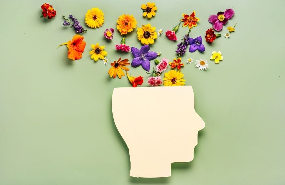
Colors have long been recognized for their ability to influence our emotions, behaviors, and overall well-being. In the context of mental health, color plays a pivotal role in both raising awareness and supporting mental health efforts. The meanings associated with different colors can evoke a wide range of psychological responses, and understanding these meanings can be a powerful tool in mental health advocacy.
Green is known for its ability to ease tension and lower stress levels. When used with intention, it creates a soothing space that promotes both physical and emotional calm. This makes it especially helpful in homes where mental clarity and emotional balance are priorities.
Green helps quiet mental noise and encourages a sense of direction. In a world filled with screens, schedules, and stress, the presence of green offers a much-needed pause. It supports mental focus without overstimulation, which makes it valuable in both personal and shared spaces.
Beyond calm and clarity, green also nurtures emotional grounding. It offers a sense of steadiness and optimism during emotional ups and downs. Used thoughtfully, it can help create an environment that encourages self-soothing and strength.
Bringing green into the home deepens the bond between indoor life and the natural world. This connection has measurable benefits for emotional wellness, focus, and overall mental health. Green acts as a bridge between built spaces and the outside world, where healing often begins.
In addition to its benefits, green is a powerful visual tool for expressing solidarity. Using it in design or daily life becomes a quiet, ongoing message of compassion and awareness. It stands for more than just peace—it’s a statement of purpose.
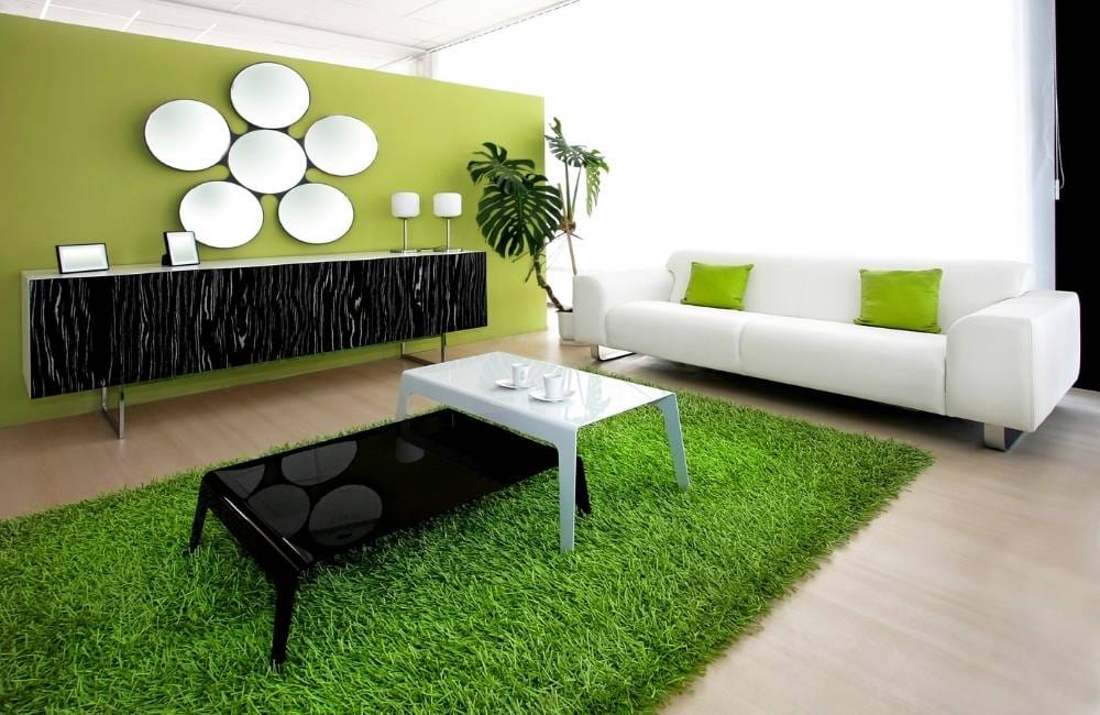
Green is a color synonymous with tranquility, growth, and renewal, making it an ideal choice for fostering a peaceful and supportive environment in your home. By incorporating green into your living space, you can promote mental well-being and create a soothing atmosphere that encourages relaxation and balance.
One of the easiest and most effective ways to incorporate green into your home is by painting your walls with soft, calming shades of green.
Lighter greens like sage, mint, or seafoam can create a serene and peaceful ambiance, making them perfect for:
Darker greens, like forest or olive, can add a touch of sophistication and warmth, ideal for spaces where you want a more grounding and comforting energy, such as:
Using green for trim, crown molding, or wainscoting adds a subtle yet intentional design element that elevates a room’s character while supporting a calming ambiance.
Lighter greens like eucalyptus or celadon work beautifully as crisp, refreshing accents in:
Darker hues such as olive or hunter green offer contrast and depth, ideal for:
Painting the ceiling in a soft shade of green is an unexpected design move that creates a cocooning effect, perfect for mental relaxation and visual interest.
Pale greens like pistachio or aloe can brighten and open up:
Bolder tones like spruce or juniper green can add drama and coziness in:
Integrate green through modern paint techniques like two-tone walls or color blocking to make a style statement while encouraging tranquility.
Try muted greens like lichen or sage as a lower wall color paired with:
Use deeper greens like moss or evergreen for:
Painting cabinetry or built-in units in a green shade offers both function and aesthetic, promoting groundedness and order, key for mental well-being.
Soft greens like mist or pale olive enhance storage solutions in:
More saturated options like pine or basil green create bold, intentional design in:
Not all greens have the same effect on mood or space. Some bring energy, while others invite stillness. Choosing the right shade means considering the purpose of each room and understanding how that shade contributes to the mental health color meanings. Working with a design professional can also make that process easier and more intentional.
Sage green is muted, almost gray-green, and ideal for creating peaceful spaces with minimal visual stimulation. It works especially well in bedrooms, therapy rooms, or quiet corners meant for decompression. Its popularity in mental health awareness color palettes stems from its ability to soothe without feeling cold or detached.
Olive green adds warmth and depth, grounding a room with its earthy tone. It pairs beautifully with natural wood, terracotta, and brass finishes, creating an inviting and emotionally balanced atmosphere. Interior designers often recommend it as a color for mental health support in living spaces or kitchens where comfort and togetherness matter.
Emerald green is rich and luxurious yet still calming when used with restraint. It brings a sense of stability and maturity, making it ideal for libraries, home offices, or formal dining rooms. Professionals who understand mental health color significance can use emerald to create confidence and quiet sophistication without overstimulation.
Mint green is crisp and clean—ideal for energizing spaces like bathrooms or breakfast nooks. Its light tone lifts the mood and adds clarity, especially in rooms with lots of natural light. Designers often lean on mint to strike a balance between peace and productivity in colors for mental health advocacy plans.
Forest green evokes stillness, like being in the middle of a quiet wooded area. It encourages inward focus and emotional grounding, which makes it well-suited for meditation rooms or deep work zones. With guidance from a design expert, this shade can highlight the green color for mental health awareness without darkening the mood of the space.
Pistachio green is a light, slightly yellow-green that feels cheerful without being loud. It promotes balanced energy and is often used in creative spaces or casual sitting rooms. Professionals who understand mental health color meanings use this tone to foster optimism and gentle stimulation in environments where joy and focus are both welcome.

Choosing the right painting professional is just as important as selecting the right color. The painter’s skill, understanding of wellness design, and ability to match the right shade to each space can shape how color supports emotional health. When working with professionals who understand mental health color significance, green becomes more than a design choice—it becomes a tool for healing and advocacy.
Painters who have worked in therapy centers, schools, or calm spaces often understand how color influences emotion. These professionals know how to apply shades like sage or mint with precision to maximize the benefits of mental health color meanings. Ask if they’ve completed projects tied to color for mental health support before finalizing a hire.
Some house painting professionals go beyond application—they offer help with shade selection too. That guidance can be especially valuable when trying to choose the best green color for mental health awareness. A trained consultant can translate emotional goals into color choices that make sense for both the room and the mind.
Different greens respond differently to light and surface texture, especially when selecting low-sheen vs. high-gloss finishes. A knowledgeable painter can explain how each option affects mood and environment. That expertise ensures that the chosen mental health awareness color delivers the intended emotional effect long after the paint dries.
Photos of past projects can reveal more than technique—they show how a space feels. Look for rooms that evoke calm, clarity, or comfort, especially in shades used for colors for mental health advocacy. This helps gauge whether their work aligns with the vision for a mentally supportive space.
Professionals focused on health and wellness will prioritize paints that are low in volatile organic compounds (VOCs). These products reduce indoor air pollution, supporting both physical and mental health. Using healthy products complements the goals behind choosing a color for mental health support in the first place.
Good house painters listen closely, offer clear input, and respect the emotional goals behind each design. A supportive professional won’t rush decisions but will work collaboratively to find the right tone of green for each space. These partnerships often lead to better results in projects rooted in mental health color significance.
Yes, green lighting can influence mood, but its effects are typically more temporary and situational compared to painted surfaces. Soft green lighting may help create a calming atmosphere in meditation spaces or during nighttime routines. While it still reflects mental health awareness color principles, long-term support is better achieved through stable design elements like paint and furnishings.
Absolutely—green is often used in waiting rooms, classrooms, and healthcare settings because of its calming and inclusive tone. Its universal appeal makes it a strong choice in colors for mental health advocacy, helping reduce anxiety and create a sense of comfort for diverse groups. Even small green accents can encourage emotional regulation in high-traffic areas.
Cultural associations with green vary—some link it to luck and prosperity, while others see it as a symbol of healing or rebirth. These variations add depth to mental health color meanings, making green a flexible yet powerful choice across different backgrounds. Designers often take these nuances into account when creating emotionally supportive spaces.
Yes, green can help balance the effects of too much screen time by creating a visual break that soothes the eyes. This makes it an excellent color for mental health support in home offices and digital-heavy environments. Incorporating green can promote better focus and prevent mental burnout from digital overload.
While green can benefit a wide range of emotional needs, it’s especially effective for those managing anxiety, stress, or burnout. Its calming properties and mental health color significance make it useful in spaces meant for grounding and emotional recovery. However, professional guidance is always recommended for condition-specific design support.

Bring warmth, calm, and color into every room with the expert touch of Fairfield Painting Contractors. Serving Fairfield, CT, with precision and care, our team blends craftsmanship with a deep understanding of how paint choices influence mood and atmosphere. Whether updating a single room or transforming the entire home, we help select colors—like soothing greens—that support well-being and comfort.
Trust Fairfield Painting Contractors to deliver finishes that feel as good as they look. Contact us today!