Why Choose Warm Neutral Kitchen Wall Colors?
Warm neutral kitchen wall colors offer a smart blend of timelessness and design flexibility. Unlike bold or seasonal tones that can quickly date a kitchen, these hues remain classic and adaptable, suiting both traditional and contemporary interiors.
Here’s why homeowners consistently turn to neutral paint with warm undertones:
- Timeless Appeal: Warm neutrals like creamy greige kitchen wall paint resist shifting trends, ensuring your kitchen remains stylish for years without the need for frequent repainting.
- Natural Warmth: Undertones of red, orange, or yellow create a cozy and welcoming atmosphere, especially valuable in the heart of the home.
- Design Flexibility: These colors complement various design styles—from rustic and industrial to Scandinavian and transitional—without clashing with existing elements.
- Space-Enhancing Effect: Neutral paint with warm undertones helps reflect light and create the illusion of a larger, brighter kitchen, especially in smaller or darker rooms.
- Effortless Pairing
- Cabinets & Countertops: Blend beautifully with wood, stone, laminate, or painted cabinetry. According to the 2024 U.S. Houzz Kitchen Trends Study, white continues to be the most common cabinetry color, chosen by 46% of homeowners. This preference underscores the enduring appeal of neutral tones in kitchen design, offering versatility and a timeless aesthetic that complements various styles and color schemes.
- Flooring: Neutral tones harmonize with both dark and light floors.
- Appliances & Fixtures: Allow stainless steel, matte black, or brass finishes to pop.
- Versatile Backdrop: Provides a clean, understated canvas that lets standout features—backsplash tiles, lighting fixtures, or artwork—take center stage.
- Mood Enhancement: Warmer hues evoke feelings of comfort and relaxation, making the kitchen a space that encourages connection and calm.
What Defines a Warm Neutral Paint Color?
To understand neutral paint with warm undertones, it helps to first know how warm tones behave. Warm neutrals are balanced shades influenced by sun-inspired hues like red, orange, and yellow, just softened and subdued to suit a versatile palette.
- Subtle Warmth: Not as saturated as true warm colors, making them more livable and adaptable.
- Chameleon Effect: These colors can shift slightly in appearance depending on surrounding hues and lighting.
- Light-Responsive: They may appear brighter and more vibrant under natural sunlight and slightly darker or more muted under artificial light.
7 Tips for Choosing the Right Warm Neutral Kitchen Wall Color
Picking the best kitchen wall color requires more than just choosing a favorite shade. The right decision depends on how that color interacts with your kitchen’s structure, light, and finishes. Here are actionable tips to guide the selection process:
1. Evaluate Natural and Artificial Light
- South-facing kitchens tend to amplify warm tones—choose muted neutrals to prevent oversaturation.
- North-facing kitchens lack warm light—opt for warmer beiges or golden undertones to offset coolness.
2. Match Surrounding Materials
- Cabinets: Pair wood finishes with warm taupes or almond.
- Counters: If using cool stone like marble or quartz, balance with creamy greige kitchen wall paint.
- Floors: Choose a tone that doesn’t clash with undertones in tile, hardwood, or vinyl.
3. Choose the Right Sheen
- Eggshell: Soft glow with light washability—great for most walls.
- Satin: Slightly shinier and more durable—ideal for high-traffic areas or splatter-prone zones.
4. Focus on Undertones
Even within beige or greige families, undertones differ. Compare side-by-side to ensure cohesion with your fixtures and furniture.
5. Use Low-VOC Paint
Opt for low-VOC warm neutral paint to reduce chemical emissions. It is ideal for families, pets, and homes with limited ventilation. Research shows that indoor levels of certain organic compounds are typically 2 to 5 times higher than outdoor levels.
Activities like paint stripping can spike those levels to as much as 1,000 times higher than typical outdoor concentrations, especially during and shortly after the task
6. Sample Multiple Shades
Don’t rely on a single chip. Paint test patches in different corners of the kitchen and observe them throughout the day.
7. Think Long-Term
Consider how your chosen shade will look with potential updates to hardware, lighting, or décor in the future.
15 Stunning Warm Neutral Kitchen Wall Colors
Each of the following shades provides a distinct flavor of warmth and neutrality, suitable for a wide range of kitchen styles.
1. Soft Taupe
Soft taupe is a versatile warm neutral kitchen wall color that brings comfort and style to a variety of spaces.
- Color Profile: Muted beige infused with light brown undertones.
- Style Match: Complements both rustic farmhouse and modern transitional kitchens.
- Material Pairings: Works well with reclaimed wood, matte black hardware, or natural stone countertops.
- Lighting Benefit: Maintains its warmth in both natural and artificial light, offering consistent visual appeal.
- Design Impact: Adds depth without darkening the space, making it great for open-concept layouts.
2. Creamy Beige
Creamy beige remains one of the most timeless and adaptable choices for kitchens.
- Color Profile: Beige softened by subtle yellow undertones.
- Natural Light Enhancer: Reflects daylight well, making small or dim kitchens feel more open.
- Trim Pairings: Beautiful next to crisp white trim, cream cabinetry, or brass finishes.
- Aesthetic Flexibility: Works equally well in traditional, coastal, and transitional design themes.
- Health Tip: Opt for a low-VOC warm neutral paint in this shade to keep indoor air quality safe and clean.
3. Buttermilk Yellow
Buttermilk yellow introduces warmth and optimism into the heart of the home without overwhelming it.
- Color Profile: Soft, creamy yellow with a slightly buttery tone.
- Mood Booster: Adds a sunny, cheerful vibe perfect for family-centered kitchens.
- Cabinet Pairings: Looks charming with white or light wood cabinetry and antique-inspired fixtures.
- Ideal Use: Best suited for cottage-style, country, or vintage kitchens that aim for a cozy atmosphere.
- Durability Option: Choose a satin finish to enhance this kitchen wall color with added durability.
4. Warm Greige
Creamy greige kitchen wall paint is a designer favorite for its subtle elegance and adaptability.
- Color Profile: A balanced mix of gray and beige with warm undertones.
- Modern Elegance: Creamy greige kitchen wall paint brings a contemporary yet inviting tone to the kitchen.
- Versatile Backdrop: Allows colorful accessories or bold backsplashes to stand out.
- Surface Match: Creamy greige kitchen wall paint pairs seamlessly with cool-toned countertops like marble or quartz as well as warm wood flooring.
- Undertone Harmony: This neutral paint with warm undertones adapts easily to changing lighting and seasons.
5. Mushroom
Mushroom tones offer a grounded and organic feel that suits various design preferences.
- Color Profile: A taupe-like mix of soft gray and brown, rich in earthiness.
- Design Compatibility: Works beautifully in transitional, modern rustic, or Scandinavian-inspired kitchens.
- Finish Friendly: Looks elegant in an eggshell finish for walls with light texture.
- Material Blend: Complements raw wood beams, brass or brushed gold hardware, and stone surfaces.
- Subtle Contrast: Provides just enough contrast against white cabinets without overpowering them.
6. Almond
Almond is a soft, approachable shade that enhances warmth while preserving a clean, neutral feel.
- Color Profile: Light beige with creamy, buttery undertones.
- Visual Appeal: Adds a gentle glow to the kitchen without feeling overly warm or yellow.
- Versatile Coordination: Blends easily with cool-toned countertops like gray quartz or white marble.
- Timelessness: A safe, elegant choice that resists dating, even as design trends evolve.
- Hardware Match: Looks refined with brushed nickel, stainless steel, or satin chrome fixtures.
- Ideal for: Homeowners seeking a balanced kitchen wall color that bridges warm and cool elements.
7. Toasted Oat
Toasted oat offers a rich take on beige, adding character and weight to kitchen walls.
- Color Profile: Medium beige with pronounced golden undertones.
- Depth and Texture: Creates visual interest without darkening the room too much.
- Design Impact: Grounds open spaces and provides warmth against sleek surfaces.
- Fixture Compatibility: Matches beautifully with matte black or antique brass hardware for high-contrast style.
- Furnishing Flexibility: Complements rustic wood finishes, woven textures, and leather bar stools.
- Sustainable Option: Available in low-VOC warm neutral paint, perfect for eco-conscious renovations.
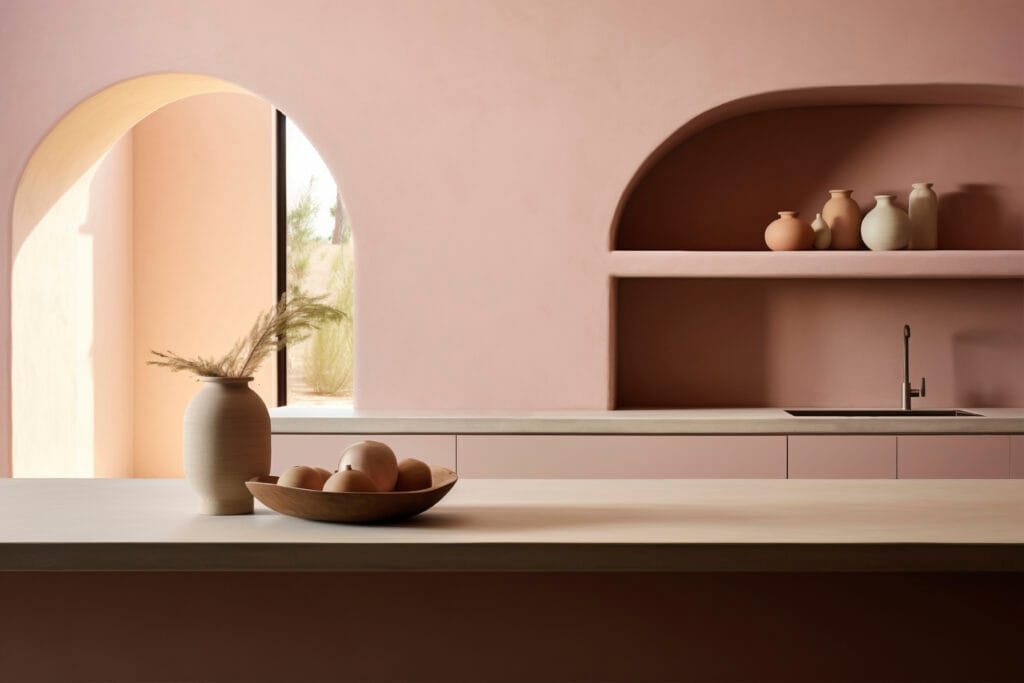
8. Pale Terracotta
Pale terracotta adds just enough color to set a space apart while remaining grounded in warmth.
- Color Profile: Soft peach-pink with earthy, sunbaked clay tones.
- Style Statement: Offers a creative twist on standard warm neutral kitchen wall colors.
- Soft Drama: Infuses personality without overpowering minimalist or mid-century kitchen styles.
- Material Harmony: Works particularly well with terra-cotta tile, light oak cabinetry, and aged brass fixtures.
- Atmospheric Quality: Creates a warm, welcoming vibe reminiscent of Mediterranean or desert-inspired interiors.
- Best For: Those wanting a slightly more expressive yet still restrained neutral paint with warm undertones.
9. Sand Dune
Sand dune is a calming, versatile tone that mimics the soft and natural look of coastal landscapes.
- Design Mood: Evokes a breezy, relaxed ambiance, perfect for homes aiming for an airy, coastal aesthetic.
- Open-Concept Friendly: Ideal for open-plan kitchens that flow into dining or living spaces—creates continuity without visual clutter.
- Material Pairings: Pairs well with rattan, white oak, sea glass tiles, or brushed stainless finishes.
- Undertone Adaptability: Works across all seasons; feels fresh in summer and warm in winter.
- Best Use: Great for transitional spaces that balance both modern and casual design elements.
10. Golden Ivory
Golden ivory brightens a room while delivering soft warmth, making it one of the most light-enhancing warm neutral kitchen wall colors.
- Color Profile: Off-white with warm yellow undertones for added dimension.
- Brightness Booster: Reflects both natural and artificial light exceptionally well—ideal for compact or poorly lit kitchens.
- Clean Yet Cozy: Offers the crispness of white but with added softness that avoids sterility.
- Design Pairings: Excellent with glossy subway tiles, open shelving, or gold-tone fixtures.
- Style Match: Suits farmhouse, cottage, or Scandinavian kitchens seeking a sunlit atmosphere.
- Eco-Friendly Tip: Look for this shade in low-VOC warm neutral paint options for a cleaner renovation.
11. Honey Beige
Honey beige brings warmth and richness without overwhelming the space, making it a standout mid-tone choice.
- Color Profile: Medium beige with golden-amber undertones that add depth and radiance.
- Comfort Factor: Creates a cozy and lived-in feel, perfect for family-centric kitchens.
- Pairing Versatility: Matches well with a wide range of cabinet colors, including walnut, maple, and white.
- Layering Potential: Serves as a strong base for layering with darker accents or textural décor like woven rugs or wood beams.
- Finish Compatibility: Maintains its warmth in both matte and satin finishes.
- Mood Influence: Balances elegance and approachability—inviting without being too casual.
12. Cappuccino
Cappuccino delivers a bold yet balanced presence, making it a standout among warm neutral kitchen wall colors.
- Color Profile: Deep beige-brown inspired by frothy coffee with warm, roasted undertones.
- Visual Depth: Adds richness and dimension, particularly effective in larger kitchens with ample natural light.
- Cabinet Contrast: Creates a striking look when paired with white, cream, or pale gray cabinetry.
- Sophisticated Edge: Brings a refined, almost café-like ambiance, perfect for elegant yet cozy settings.
- Finish Tip: Use a satin or semi-gloss finish to prevent the tone from appearing too heavy or flat.
- Ideal For: Modern classic, transitional, or industrial kitchens that benefit from earthy sophistication.
13. Peachy Tan
Peachy tan introduces a delicate warmth, perfect for those wanting a hint of personality without sacrificing neutrality.
- Color Profile: A soft tan with a gentle blush or peach undertone.
- Charming Warmth: Adds subtle color while keeping the palette grounded and calming.
- Style Flexibility: Complements vintage, shabby chic, or eclectic kitchen styles with artistic elements.
- Surface Pairings: Matches well with copper, bronze, or rose gold accents and open shelving.
- Soft Light Enhancement: Gently reflects ambient light to maintain warmth throughout the day.
- Design Benefit: Adds visual softness, making it an excellent balance between neutral and expressive.
14. Light Caramel
Light caramel is a rich, dessert-toned hue that delivers a warm and cozy visual flavor.
- Color Profile: Warm golden-brown reminiscent of toffee or sweet caramel glaze.
- North-Facing Room Solution: Ideal for kitchens with limited natural light—counteracts cool shadows effectively.
- Visual Weight: Offers depth without making the space feel heavy, especially when used with lighter trims.
- Pairing Suggestions: Looks elegant with navy cabinetry, butcher block counters, and vintage-inspired fixtures.
- Texture Amplifier: Enhances the look of natural materials like wood, jute, and rattan.
- VOC Tip: Opt for a low-VOC warm neutral paint in this shade to preserve air quality while creating a cozy setting.
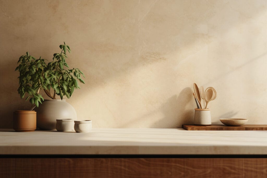
15. Wheat
Wheat serves as a soft, earthy neutral with a bright and natural disposition—ideal for minimalist design approaches.
- Color Profile: Balanced blend of muted yellow and beige that resembles sun-dried grain.
- Design Philosophy: Works beautifully in Japandi or Scandinavian interiors focused on simplicity and function.
- Natural Connection: Evokes the tranquility of nature and brings outdoor inspiration into the kitchen.
- Furnishing Fit: Perfect backdrop for light wood cabinetry, ceramic tile, and neutral-toned décor.
- Airy Feel: Keeps spaces looking bright and spacious while maintaining a grounded warmth.
- Everyday Appeal: Subtle enough for everyday living but stylish enough to elevate the overall aesthetic.